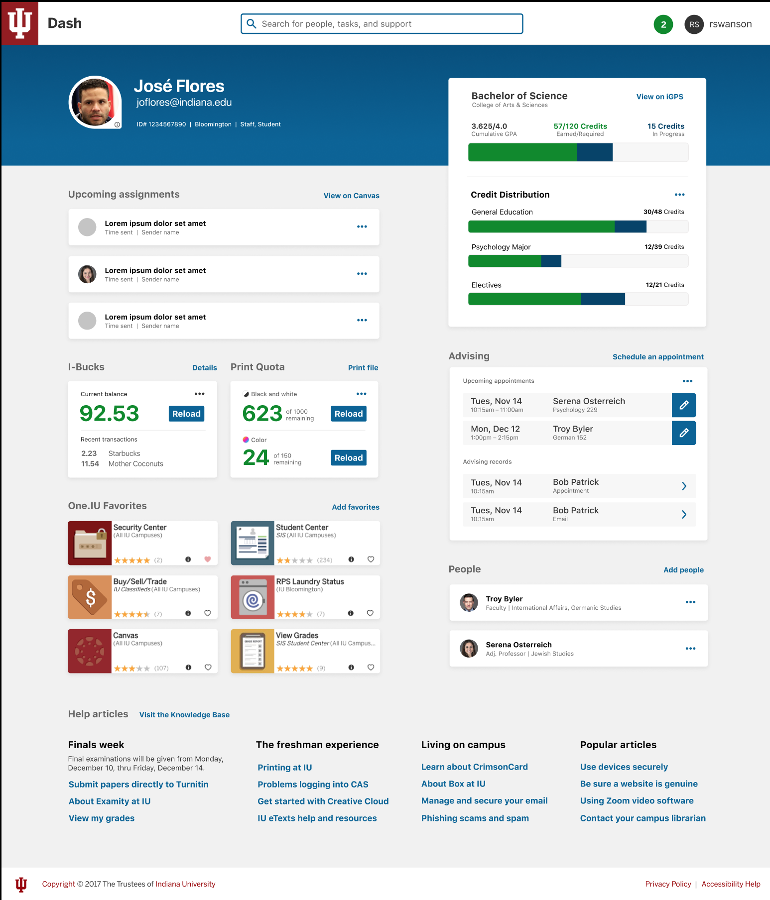
A new way for students to interact with their data and accomplish online tasks at Indiana University is long overdue. In the current environment, One.iu.edu., Canvas, iGPS, and Student Services (SIS) ar the four main data and service providers for students. In this environment, students must either know where to go directly to accomplish a task or find information, or they need to know what they are looking for and the right terminology to search for in One.iu.edu.In addition, IU has many great services that students are not likely to even know are available. Discoverability for unknown services is poor. If the student doesn’t know something exists, they are unlikely to search for it or discover it spontaneously.
As a first step towards a unified student environment, I recommend creating a dashboard that provides an overview of the most important student data. The page would showcase a series of widgets that pull together relevant data to help the student navigate their day, semester, and academic career. The dashboard would integrate a new Notifications system and an improved Search to facilitate getting the right information to the student. The overarching goal is providing services geared toward student success, integrated with information/applications that can make student daily life easier, as well. See the Student Dashboard project page for more information on the proof-of-concept or review the Student Dashboard project slides (.pdf).

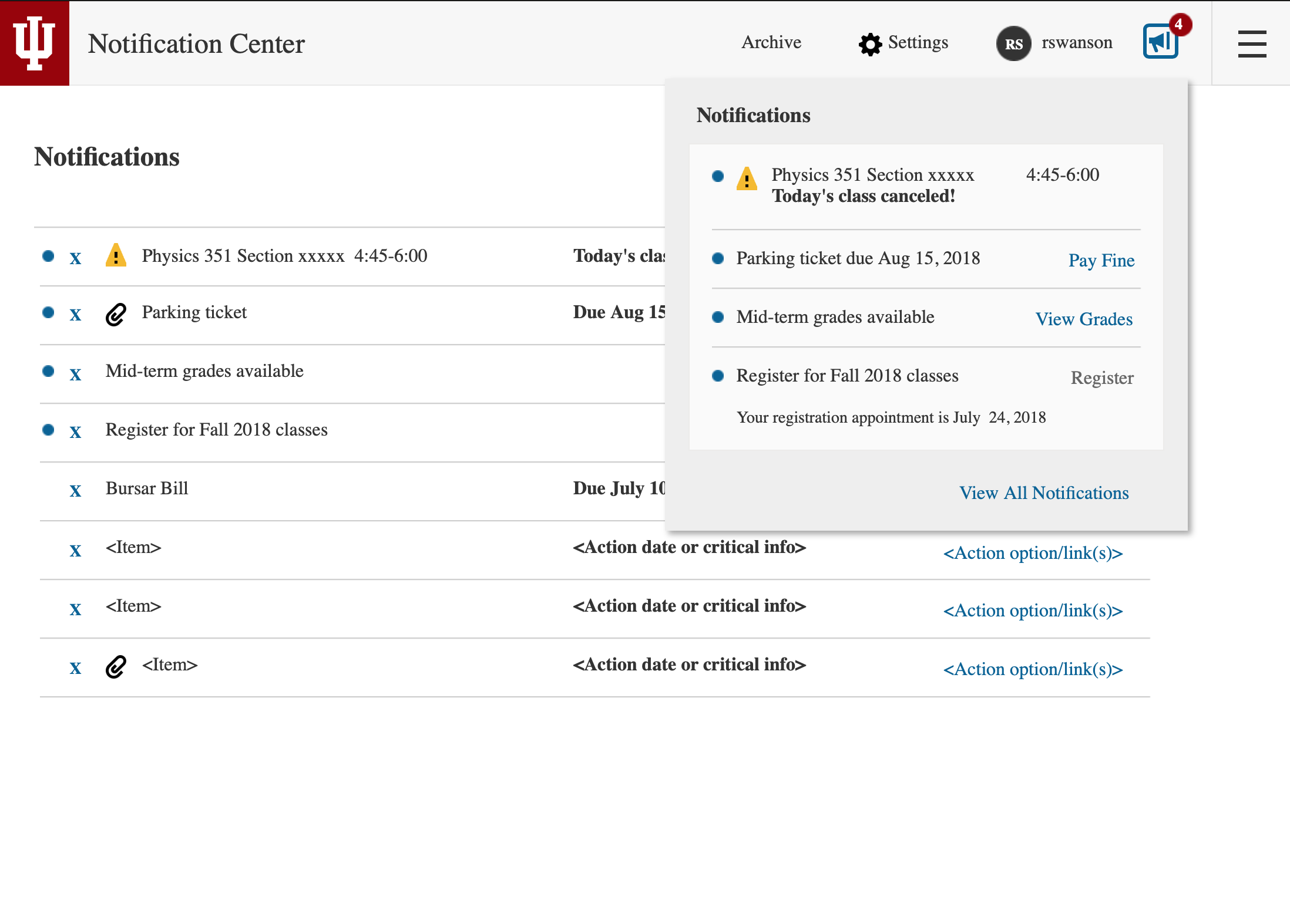
Indiana University currently does not have an enterprise-wide system for delivering or viewing important notifications. Individual system rely on a variety of distributions methods from postal mail to email to in service notifications (which requires the user to log in to discover and view). From the receiving end, users must proactively check multiple locations to see if any information has been sent to them. Should the user overlook an email or fail to log in to a given service, they may easily miss an important notification requiring them to take action.
To help alleviate this problem, I've recommended a single system that drives distribution of important information and provides a singal notification center for users to obtain their high priority information. In addition, integrating an icon and badge into the IU header that alerts users to new notifications will help assure the user is alerted to new content without having to navigate to any specific service. This service is now in development (as of early 2019). Learn more on the Notifications Project page or view the Notification Wireframes.
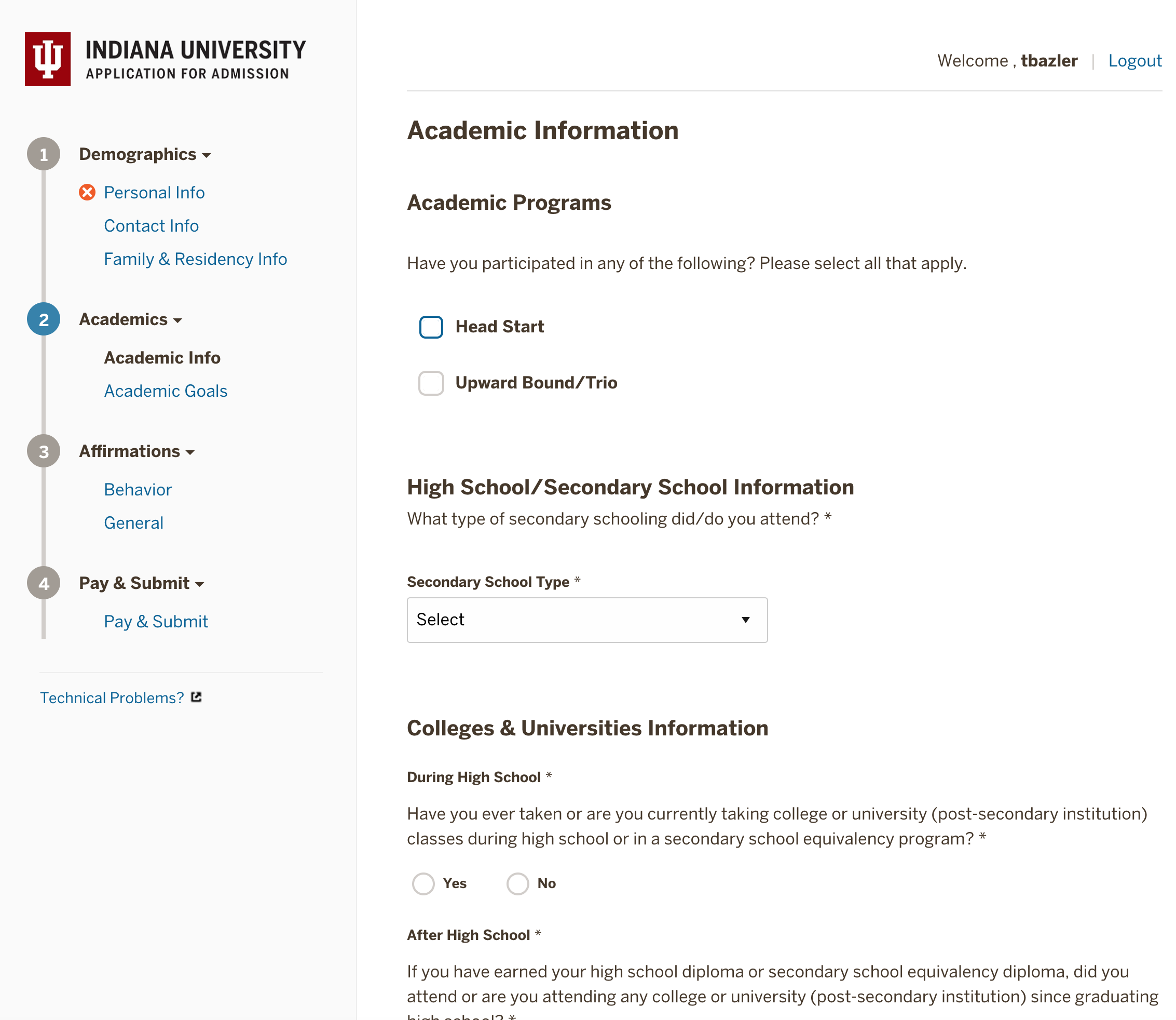
The online undergraduate admissions application was in need of a complete redesign for both the front and back end of the system. The look was very dated, the interface was confusing, and the system had been developed in a language that was not optimal for ongoing maintenance or development. In addition, it was designed and built before teams within the organization considered or even understood responsive design. Therefore, developing the new system to work for students regardless of device was a primary goal. Another goal was to consolidate the vast number of application versions that existed across the many departments and campuses of the univeristy. For additional screenshots and information, please visit the Apply IU Project page.
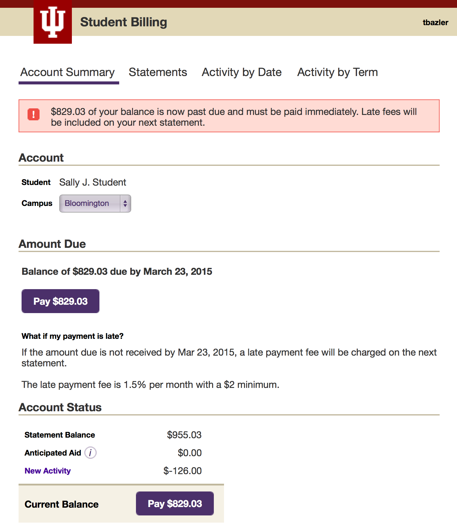
The student billing system was brought in-house in 2013 (see below for more details of this original project). At that time, the billing service was intended and designed to be a small content area within the context of a student portal. Unfortunately, the student portal was subsequently abandoned and, despite not being designed to be a stand-alone application, the billing service was released to students. Several questionable changes were also made to the application following the design work. The design changes and being displayed out of any unifying context caused the service to look unfinished at best and be confusing to many. This new student billing project was brought back for design work to update the navgation and the overall look of the system. In addition, a few of the requirements from the original project have been removed allowing greater freedom to better serve the end user. See the Student Billing project for additional details.
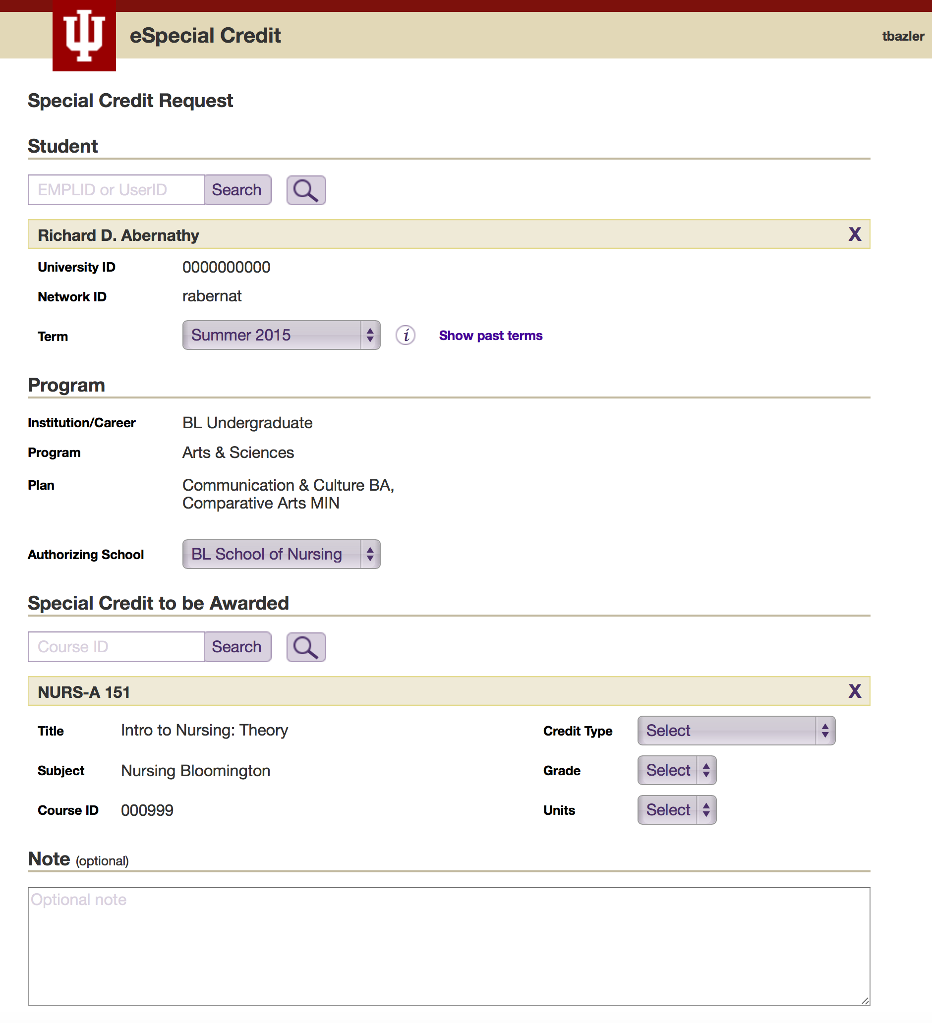
Redesign of a system used by university administrators to request course credit for students based on qualifying work and life experiences. The new system will eliminate the need for much of the data entry required by the original system, as well as updating the design and interactions of the user interface. View additional details and screenshots in the eSpecial Credit Request project.
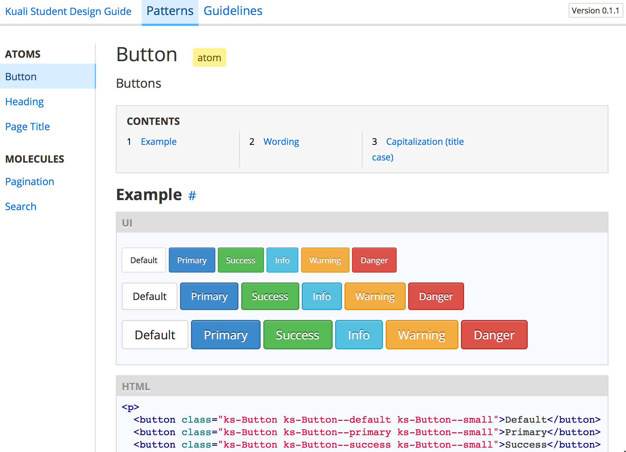
Kuali Student Design Guide - Proof of concept of a new design guide on GitHub for Kuali Student. The primary target audience for this work was user experience (UX) designers and user interface (UI) developers working within the KS project but the guide would also have contained information helpful to the full range of KS stakeholders concerning design and interface decisions.
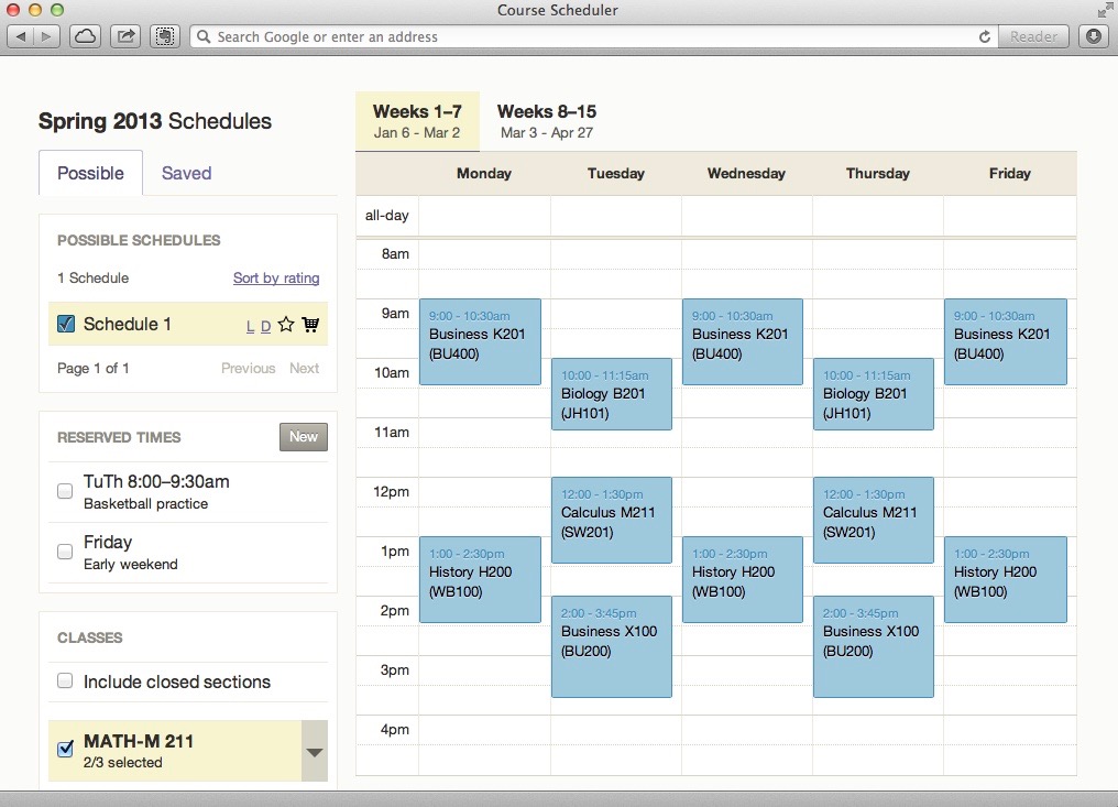
Early design work on a tool to assist students with building a schedule for a selected semester. The tool would allow users to specify a variety of criteria and restrictions to find their ideal schedule. View additional details and screenshots from the schedule builder project.
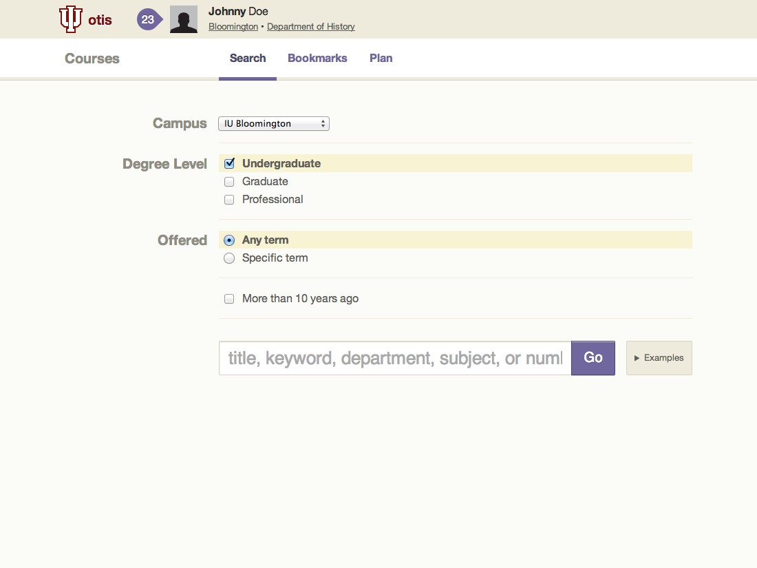
In moving to a new frontend for the IU Peoplesoft course search functionality, a major goal was to simplify the design of both the search page and the results screens. To accomplish this, the initial search parameters were kept to a minimum and the backend search functionality was recoded to accept any keywords including course code, title, professor name, subject, etc. After obtaining initial results, the student was given the ability to filter results further based on course level, keywords, and a number of other facets associated with the courses. View the proof of concept in action on Vimeo - Course search demo.
New in-house billing system for IU students to view and pay their university bills. In prior years, the students were connected to an outside vendor for all of this information and functionality. Bringing the system inhouse allowed us to add in priority features for both the business side and the end users.
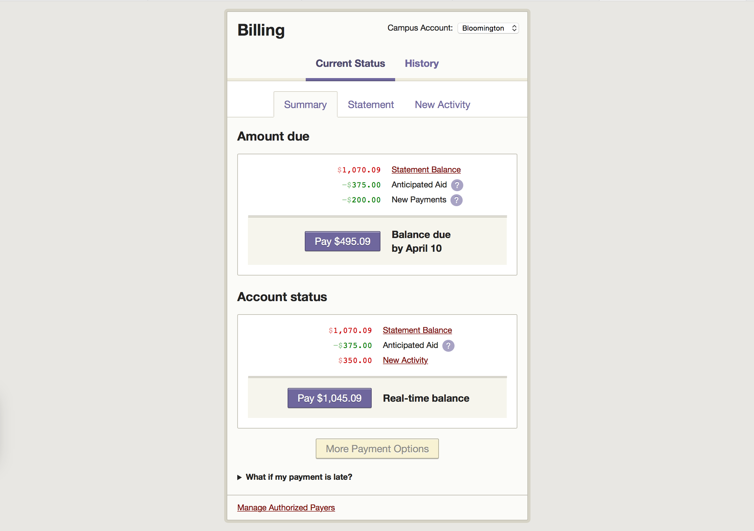
Members of the Process Experience Architecture Group conducted a design critique of the new design. Overall, students were pleased with the new service. Review the design critique report.
Exploring options for a new student portal
Work began in April 2012 with 4 focus groups. In addition to obtaining input from students concerning their use of the OneStart portal, we also conducted card sorts to help guide the overall information architecture of our new designs. An overview of the initial work and summary of background information was presented to stakeholders in May 2012.
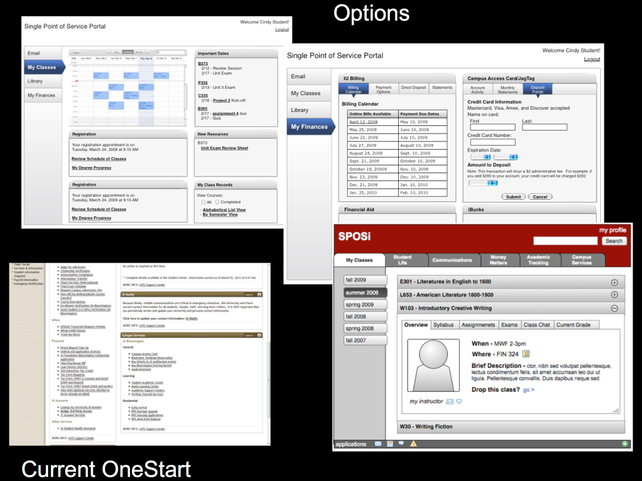
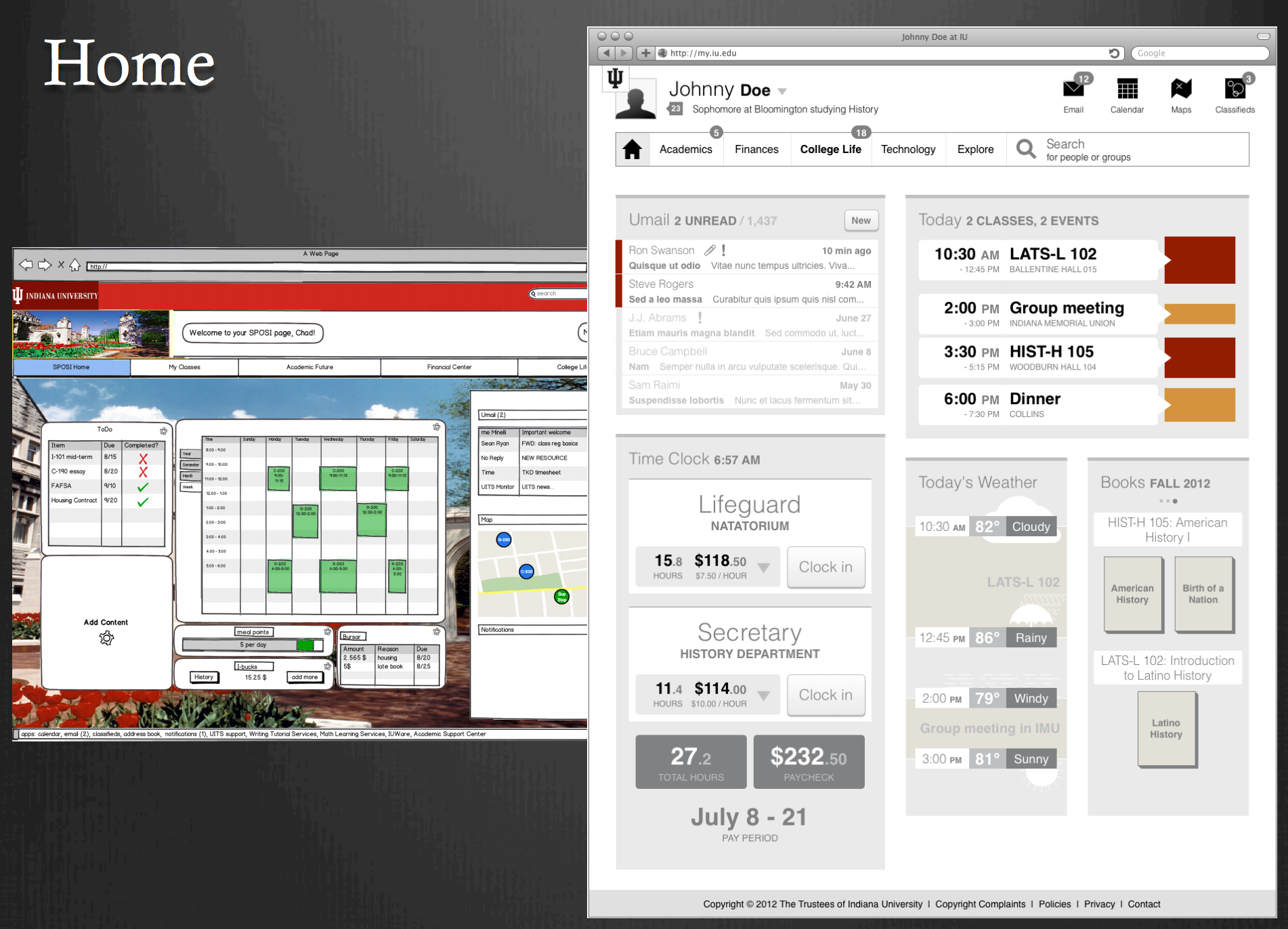
Summer Intern Update - Presentation highlighting the Process Experience Architecture group's work completed with the assistance of student interns throughout summer 2012.
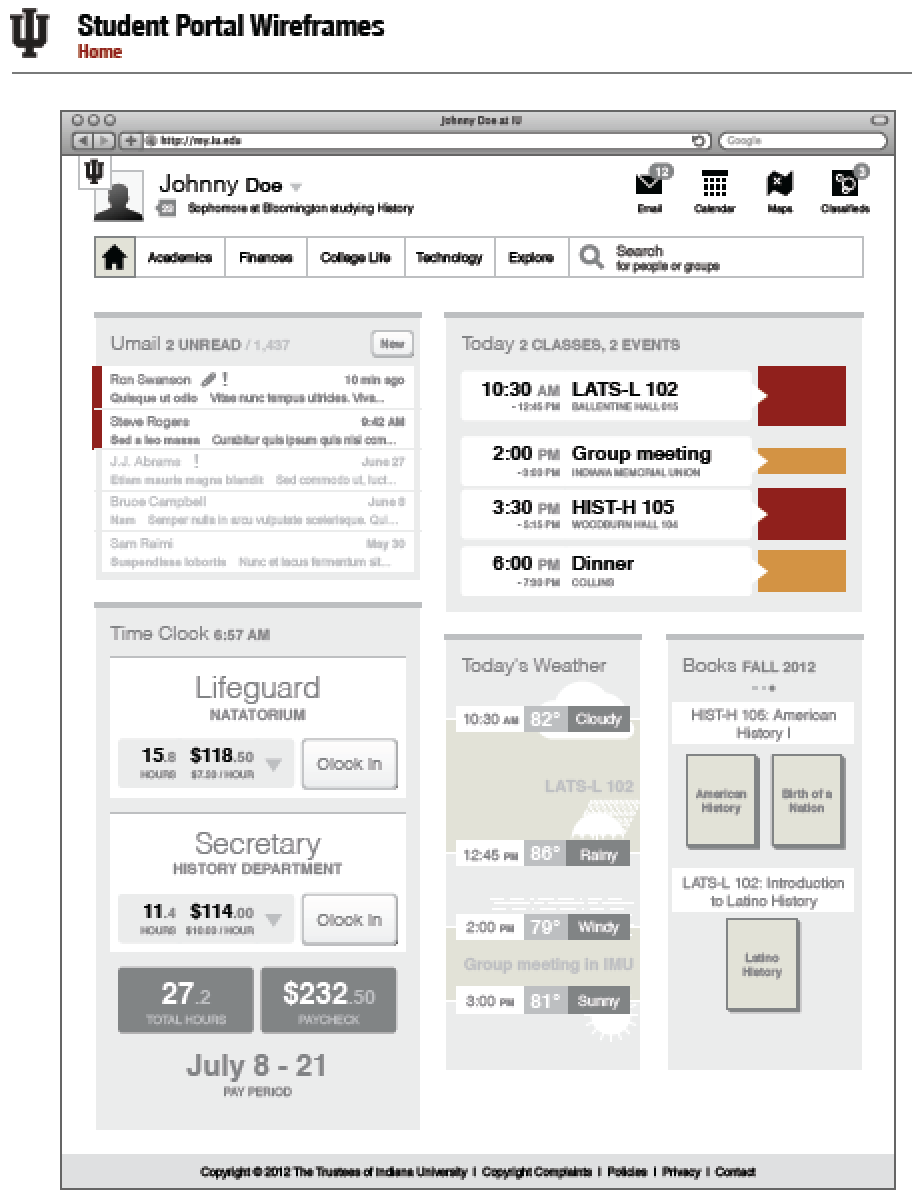
Student portal exploratory design - One of our primary goals was to provide users with relevant, dynamic data (as shown in the image below) when they logged into the portal. In order to meet this goal, a number of widgets and exploratory concepts were designed to illustrate services we might present to our students. The widgets contained real-time data to give users an overview of their information, dashboard style. Please see Reinvisioning the IU Student Portal for an overview of the work completed.
Mobile Strategies - Document created as part of an ongoing discussion concerning moving forward with student facing services for the Kuali Student (KS) project.
Registration Prep -a quick survey of issues to consider for the first student facing KS service.