A design project by the Process Experience Architecture (PXA) Group
A new way for students to interact with their data and accomplish online tasks at Indiana University (IU) is long overdue. Currently, students must interact with a number of systems including Oncourse, OneStart, Student Center (SIS), and multiple websites in order to access pertinent information. Each system and website has it’s own look and feel, different navigational structures and basic terminology. Students frequently have difficulty understanding how to complete various tasks or knowing where to go to find the information they need. For example, the current process for registering for classes requires students to log into the student center to actually register. However, much of the information students want in order to make their decisions concerning what classes to register for is within other systems and websites. The process has not been streamlined and students are left to their own devices to located relevant information.
The goal for the new student environment is to create a single site with information organized using well-understood terminology that seamlessly guides students through common tasks. Regardless of what system/database information is stored in, data should be provided to the student at the time and place needed to accomplish the goal.
In the current systems, many users complain that they do not know where to go to locate the information they are looking for. The terminology does not make sense to them and does not provide them with a clear idea of what to expect if they navigation to the different sections. In order to get a better understanding of what sort of content organization made sense for the new student environment, a number of card sort activities were conducted. Participants were given cards labeled with various services and tasks. Their assignment was to arrange those items into categories that made the most sense to them. They were instructed to create as many or as few categories as needed and they could create any labels that made sense to them. Participants were also encouraged to set items aside that didn’t make sense to them within the context of a student environment.
The results of the card sort activities led to four top-level categories including ‘Academics’, ‘Finances’, ‘College Life’, and ‘Technology’. In addition, a section called ‘Explore’ will be available as part of the Roadmap content. The four main labels are terms that students came up with and/or understood with ease. In repeated testing of those labels, participants could create a very accurate model of the types of information and content that would be within each of the sections.
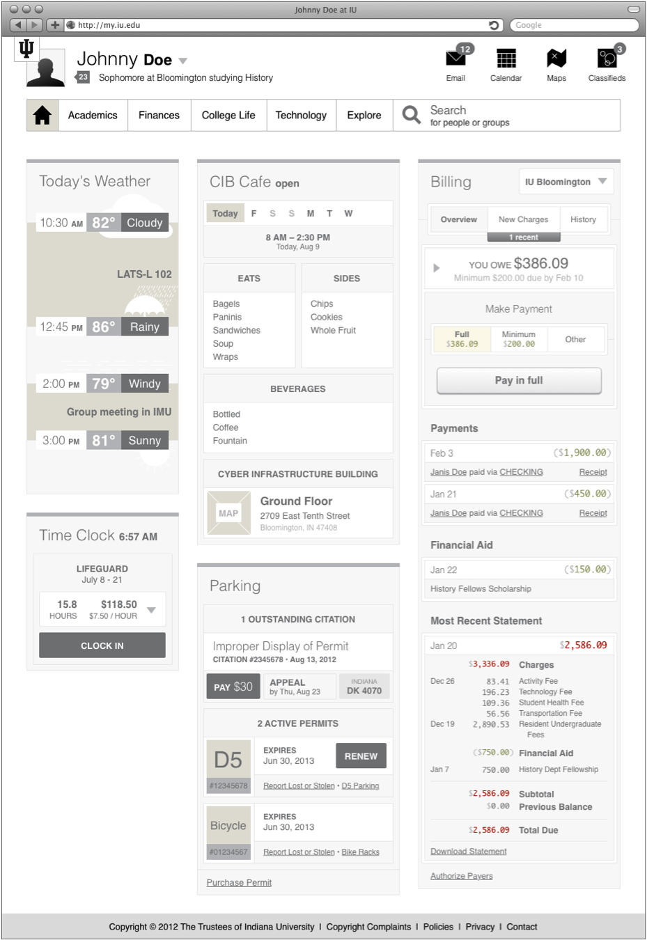
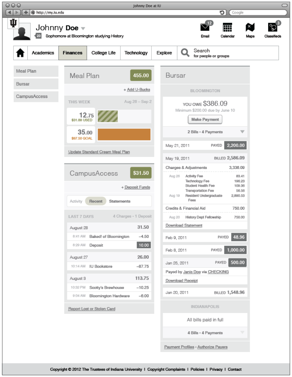
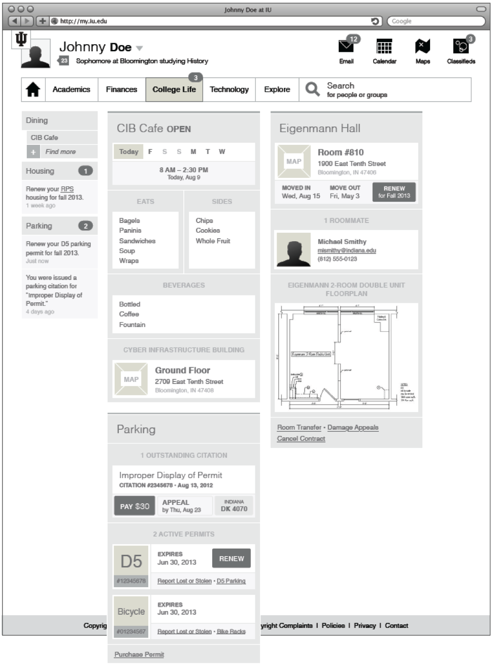
Landing pages within the new student environment refer to the initial page a user would see when logging in and navigating to any of the top-level sections of the site. The content on the landing pages (with the exception of ‘Explore’) will provide users with a dashboard-like look at pertinent information. Since August, the PXA has developed wireframes of a number of widgets, as examples of the type of content users will see. In most cases, widgets contain information customized for the student and contain combinations of information that, together provide more salient information than if displayed separately. For example, the weather widget, as envisioned here, combines the hourly forecast with the student’s schedule to highlight weather concerns during transition times in the student’s day.
Below, the weather widget and a sampling of additional content that would live in the new environment are shown including:

Please see the 'Additional Landing Page Examples' section below for further examples of landing page content. Work will continue on these widgets and they will be refined with the help of stakeholder feedback (including end user, technical, and functional stakeholders), and transformed from wireframes to html and css in preparation for working prototypes.
In early September 2012, the SIS team (Sandy Thompson), ESPD team (Nate Johnson), and the PXA team (Tara Bazler) met with Aaron Neal to discuss the best way to move forward on the student project. It was determined that the three teams should work together on a proof of concept for the new student environment. The goal was to not only begin creating a working prototype, but to use this exercise as a means for estimating resources (time, staff) for completing larger portions of the project. The proof of concept would allow us to start determining how the various pieces – front end (PXA), student environment (ESPD), and back end systems (in this case, SIS) containing student data – would work together to allow us to display information in this new environment.
After some research, the SIS team suggested that we start with the high-level course search functionality (which is much less complex than the class search). Course search is something the SIS team felt could be accomplished in a relatively short amount of time, lending itself well to our goals. In addition, this functionality will be required for class search, as well as the degree planner, which is a high priority item to the Roadmap Committee.
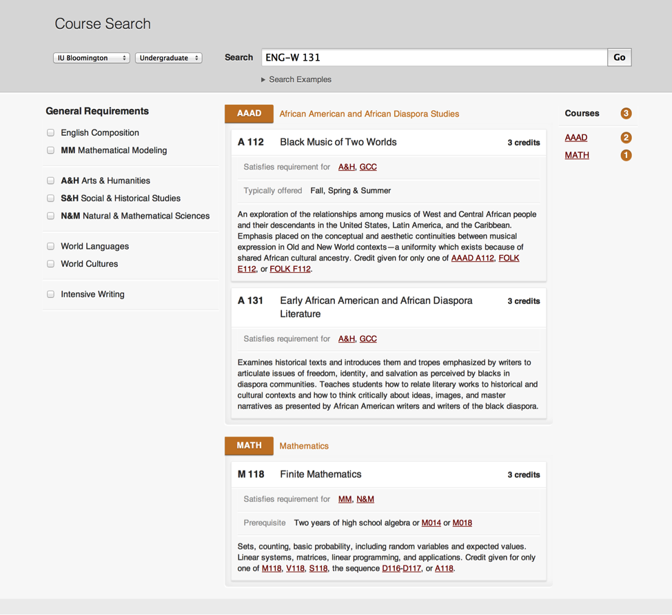
The PXA created screens for the course search including production ready HTML and CSS. In creating the course search, the goal was to provide an interface and tools that help students successfully locate desired courses in a manner quite different from the current course search. A common issue students’ express is locating courses that meet the various degree requirements such as Social & Historical Studies. In the PXA prototype, the user would be able to filter results by the general education requirements specified by their campus/degree (when logged in). In addition, within the search results, the user would be able to jump to courses matching their search terms that are offered within a specific department using the links to the right of the search results.
In developing the search screens, initial ideas were generated in the form of mockups. PXA staff conducted short UX sessions to obtain student feedback on the screens, as well as the functionality of the course search. Students were delighted to see options that would assist them throughout the process of searching for courses, including the ability to filter courses based on degree requirements.
The Roadmap Committee, at their August meeting, identified the 4-year degree planner as one of the top priorities. As a result, preliminary work started on this module. The PXA reviewed exemplars from other universities and created a list of requirements and initial wireframes for this service. The degree planner would allow students to plan out a course of study for their time at the university. The service would allow students to search for courses/classes and add them to a plan in the year and semester they want to take them. After a plan is completely filled out, the user can run an audit on the plan to see if their proposed courses will fulfill their degree requirements and lead to graduation. Students will be alerted to talk with their advisor concerning their plan, to assure that selected courses meet the specific requirements of their degree program/department. Students will be able to create as many plans as they would like and select a degree program of choice. Templates would be provided to assist students in creating their plan or they can choose to create their plan from scratch.
A significant amount of time was spent by student interns on understanding and exploring what a degree planning tool would do and how the information would be displayed. Due to other work requirements, the ideas were not refined and developed into higher-level fidelity prototypes prior to the decision to go with University of Washington's My Plan. View some initial Degree Planner Wireframes.
Notifications are an essential part of the new student environment and were also deemed a top priority. The universtiy must be able to alert students to important information in a manner other than email. To be effective, the notification system must be well planned and judicioulsy used. Notifications must be reserved for things that have immediate importance and relevance to the student. In most cases, this will mean information associated with an action the student needs to take. For example, paying a bursar bill or the financial statement being ready to view (in preparation for payment). Other examples might include registration date and time, renew parking permit, view/pay parking violation, renew/request dorm room, library book due/overdue, requested library book available for pick up, etc. In each of these cases, the key is that the information is targeted to and relevant to the specific student - it is not just a general announcement going out to the masses.
What warrants the status of a notificaiton must be carefully deteremined. If too many notificaitons that the student deems irrelevant are pushed to students, the likelihood of disregarding all notifications increases dramatically. General announcements should be pushed to students via a different means with the student having the ability to opt in/out (examples of this might include: department events, campus events, news items, tec.).
Initial design work was completed and a number of options for displaying notification indicators with the new student environment were created.
In all of the PXA work, obtaining input and feedback from the user is vital. A number of methods are used to acquire feedback including focus groups, design critiques, interviews, contextual inquiry, informal user experience (UX) sessions, and user testing. Throughout the development lifecycle, iteratively obtaining feedback and making necessary adjustments to the interface/functionality is key to developing a system that will ultimately meet the end users’ goals.
Prior to beginning work on a new student environment, focus groups were conducted. The purpose of the initial focus groups was to gather information concerning what students liked or disliked about the various online environments they currently had to access. What features and functionalities did they like or not like and did the current setup empower them to accomplish the tasks they needed to do. The input received highlighted issues that needed to be resolved and guided the designers as early work began.
As specific functionality was explored, such as registration and course search, user feedback was again sought in the form of short informal UX sessions. These UX reviews involved developing low fidelity wireframes, printing out screenshots that illustrated the process of completing a specific task and presenting those to users for their feedback. Short UX sessions help the designers refine the interface, verify that necessary functionality has (or has not) been accounted for, adjust terminology, etc. prior to development of production ready HTML.
Please Note: All landing page screens are in initial, rough form and will continue to be revised and refined as work continues. Additional content will also be added to the landing pages. Landing page content shown is simply a starting point to build on. Wireframes have initially been developed (for the most part) in shades of gray to focus on layout and the presentation of data rather than aesthetics. Work on branding, colors, and other aesthetic aspects will be added over time.
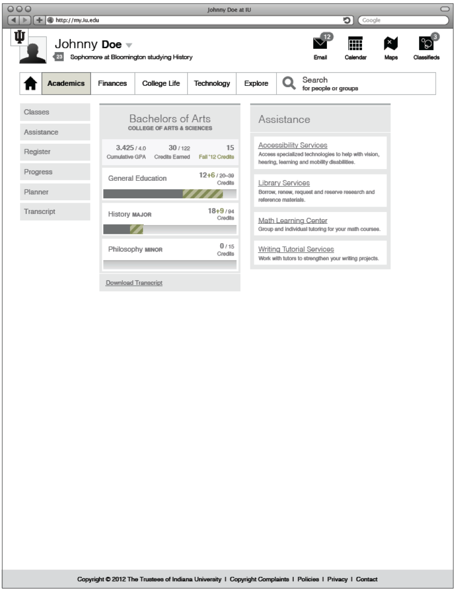
In it's initial state, the academics landing page included an overview of the student's progress in their degree and an 'Assistance' widget that would provide information on various academic student service. Ultimately, the goal was to design additional widges including an overview of the day’s classes, upcoming assignments/tests, etc.
Content would be displayed based on the user and campus. Campus Access, an IU service provided to Bloomington Students, would show for Bloomington students whereas JagTag, a service provided only to IUPUI studnents, would show for IUPUI students, etc.
The college life section would include a variety of information including: Health & Wellness, Housing, Transportation, News, Student job opportunities, volunteering, etc.
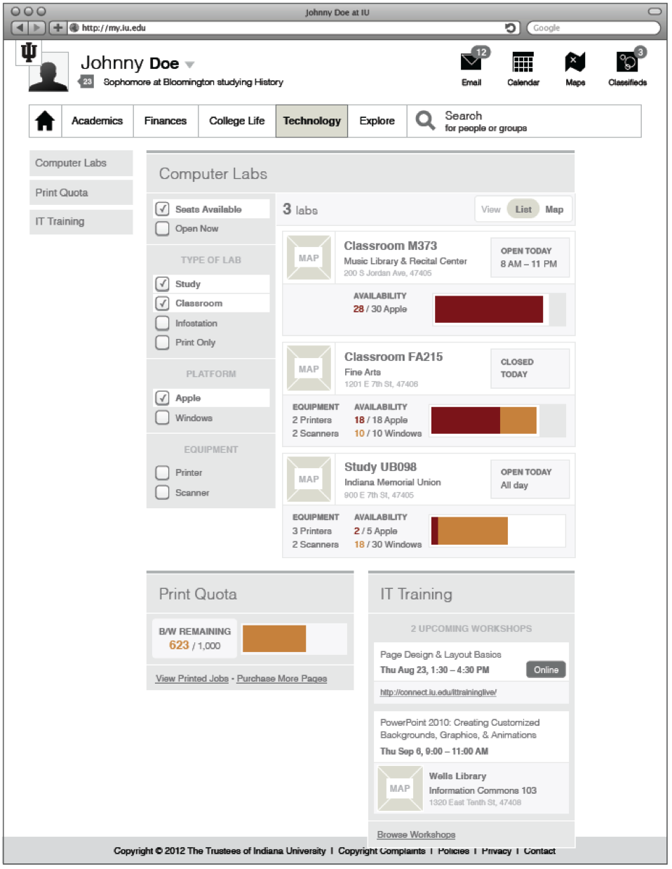
The Technology section would include information concerning computer labs, IUware, vendor deals, print quota, adaptive technology resources, training workshops, etc. Might also include access to online/chat support resources.
